


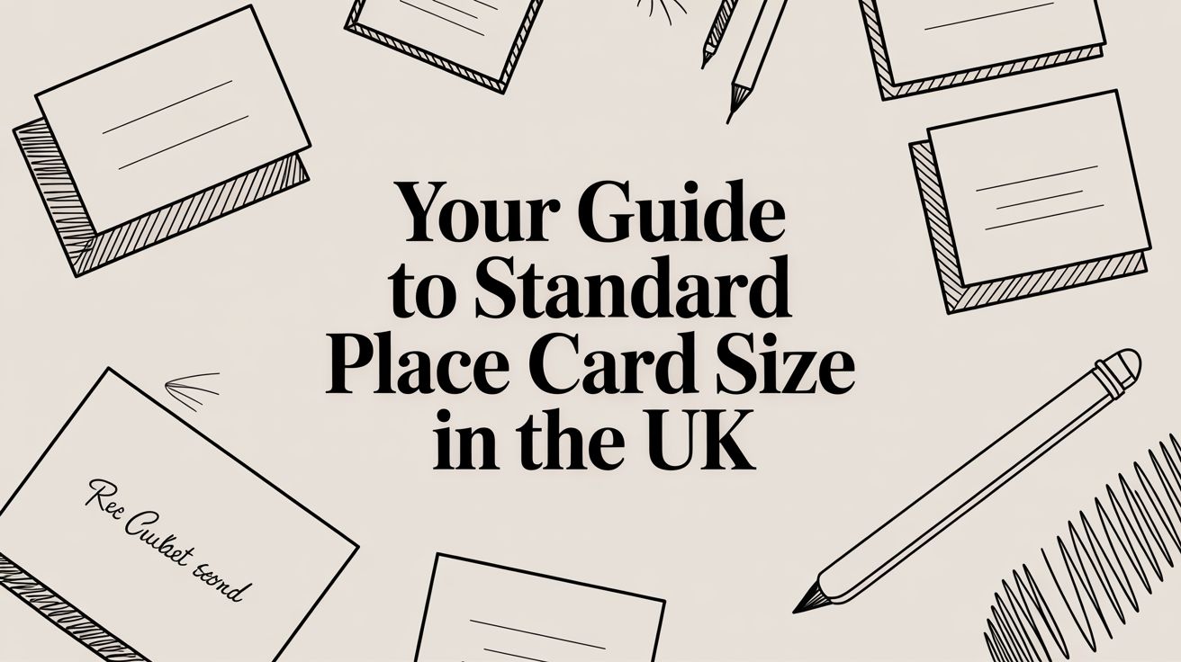
Your Guide to Standard Place Card Size in the UK
You’re halfway through setting a room for service. Cutlery is polished, glasses are aligned, and the seating plan makes sense. Then the place cards arrive and something’s off. They’re too large for the charger plates, too small to read in low light, or too flimsy to stand once guests start moving around the table.
That’s when people realise place card size isn’t a tiny stationery detail. It affects layout, service speed, guest flow, and how polished the whole event feels. For UK caterers, it also affects print efficiency, stock choice, and waste. A card that works well on a spacious styled shoot can be completely wrong for a packed wedding breakfast or a corporate dinner with tight covers and fast turnaround.
Why Place Card Size Matters for a Flawless Event
A place card only does a small job, but it does it at an important moment. Guests arrive, scan the table, and try to settle in without asking staff for help. If the card is clear, stable, and easy to spot, the table starts calmly. If it isn’t, small delays spread fast.

Small card, big operational impact
Think about a plated wedding dinner. Front-of-house staff need guests in the correct seats so meals land in the right place. The kitchen needs any dietary identifiers to be visible without making the card look clinical. Guests want to sit down without hovering awkwardly around a table reading tiny names.
That’s why a well-sized place card helps beyond appearance. Surveys from UK wedding planners show that place cards boost guest satisfaction by 62%, reduce seating disputes by 70% compared with charts, and are used to integrate meal choices for 75% of plated dinners, with the same discussion noting their fit with service and hygiene needs in formal dining setups (Kelly McWilliams).
Practical rule: If a guest can’t spot their seat and a server can’t read the card while moving past, the card is the wrong size or layout, even if it looks attractive close up.
Why caterers care more than planners think
A planner may look at colour, paper texture, and calligraphy. A caterer sees traffic points, tray routes, and crowded tabletops. Both matter. The problem comes when style wins and function gets squeezed.
Common issues include:
- Cards that dominate the place setting and push glasses or side plates out of alignment.
- Cards that disappear beside centrepieces because they’re too short or too narrow.
- Cards with no room for useful detail, such as a meal marker or surname initial.
- Cards that topple on linen or uneven outdoor tables.
For teams that need extra inspiration on the naming and personalisation side, this guide to custom name labels for a flawless event is a useful companion resource.
A guest won’t compliment the dimensions of a place card. They will notice when the room feels organised. That’s the point.
A Breakdown of Standard Place Card Dimensions
In the UK, the safest starting point is simple. The standard place card size is roughly the size of a business card. That familiar proportion is one reason it works well. It gives enough room for a name, stays neat on the table, and prints efficiently.

According to a UK-focused place card guide, the standard is approximately 85mm x 55mm, while a folded tent card is 89mm x 64mm. That folded size is practical because six cards can be printed per A4 sheet, which helps reduce material waste in bulk production (Placecard Me).
The three formats you’ll see most often
Here’s the easiest way to think about them.
| Format | Typical use | Practical note |
|---|---|---|
| Flat card | Used in a holder or laid on a napkin/plate | Clean look, but needs support or careful placement |
| Tented card | Folded to stand on its own | Best all-rounder for most catered events |
| Mini card | Tight tables, tasting events, informal service | Saves space, but limits what you can print |
Flat place cards
Flat cards are exactly what they sound like. One single piece, no fold. They suit more formal styling when you want a low profile look, perhaps resting on a napkin, menu, or charger.
They work best when:
- You’re using holders that match the table styling.
- You want a clean front face with no visible fold.
- The table has enough breathing room for an extra element.
The downside is practical. If there’s no holder, a flat card can shift during setup or disappear visually once the room fills up.
Tented place cards
Tented cards are the standard choice for good reason. They stand on their own, they’re easy to read from both seated and standing positions, and they don’t need extra hardware.
For many UK caterers, this is the most sensible place card size because it balances three things at once:
- Readability
- Table efficiency
- Print economy on A4 stock
That last point matters more than many new caterers expect. If your team is printing dozens or hundreds of cards, the sheet layout affects waste, prep time, and replacement costs.
A place card that fits the printer sheet is easier to manage on the table too. Good production decisions lead to better service decisions.
Mini place cards
Mini cards are useful, but they’re not universal. They suit crowded café event tables, compact pop-ups, tasting menus, and simpler seat naming where only the first name is needed.
Use them with caution if you need:
- a full guest name
- a dietary marker
- strong visibility in dim venues
- quick identification by agency staff who don’t know the seating plan
When people ask for the “standard” place card size, they’re asking for the safest default. In UK hospitality, that means starting near 85mm x 55mm and adjusting only when the table plan gives you a clear reason.
How to Choose the Right Size for Your Table Layout
The right place card size depends less on trends and more on table pressure. By that, I mean how much visual and physical competition the card has around it. Glassware, folded napkins, charger plates, menus, favours, candles, and floral work all compete for the same few inches of table space.

Match the card to the table, not the mood board
A long banquet table behaves differently from a round table. On a banquet run, guests approach from one side and scan across. Cards need to be visible at a slight angle. On a round table, guests stand around the perimeter first, then move inward, so cards need to be easy to find among central décor.
Use this quick comparison:
| Table setup | Better choice | Why it works |
|---|---|---|
| Crowded round table | Smaller tented card | Freestanding and compact |
| Formal wide place setting | Standard tented or flat with holder | More room for a refined look |
| Buffet or mixed seating event | Simple tented card | Easy to move and reset |
| Outdoor table | Tented card in sturdier stock | Less likely to slide or curl |
If you’re styling with layered crockery, it also helps to look at the charger footprint. A larger charger changes how much visual room you have for the card. This guide to charger plates can help you judge proportions in real setups: https://thechefroyale.com/glass-plate-charger/
Three questions to ask before you print
New caterers choose a size first and test it later. Reverse that. Ask these questions before anyone opens a template.
How much information must the card hold
A first name only is very different from a full name plus meal indicator.Where will guests first see it
On entry, from standing height, or only once they reach the table.What else is sharing the same visual zone
Menus, favours, folded napkins, bread plates, and glass stems all matter.
A quick visual check helps more than any measurement on paper. Put one sample card on a fully dressed table before committing to the whole run.
Test in service conditions
A card can look perfect in the office and fail in the venue. Low light changes readability. Linen texture affects stability. Outdoor air movement changes everything.
Here’s a useful walkthrough if you want to see table placement decisions in action:
If the setup team needs to keep adjusting the card angle during layout, the format is fighting the table. Pick a different size or fold.
The best choice isn’t the prettiest in isolation. It’s the one that still works once every plate, glass, and guest is in the room.
Essential Print and File Setup Specifications
Most place card printing problems start before anything is printed. They begin in the file. Text sits too close to the edge, folds run through the name, or the artwork looks sharp on screen but soft on paper.

If you’re designing in-house, keep the setup boring and consistent. Boring files produce reliable results. Fancy last-minute adjustments create trimming problems.
The four print settings that matter most
Start with these basics:
Set the document to final card size first
If the folded card will finish at one size, build the file with that outcome in mind. For tent cards, make sure you know whether the printer wants the folded size or the unfolded panel.Use 300 DPI for print images
This keeps text and artwork crisp. Anything lower can look fuzzy, on names in smaller type.Build in bleed
Bleed is extra background area beyond the cut line. It stops thin white edges appearing if the trim shifts slightly.Keep names inside a safe area
Don’t place text too close to the edge or fold. Give it breathing room so minor cutting movement doesn’t ruin the card.
An easy way to think about bleed, trim, and safe area
Treat the card like a framed photo.
- Bleed is the part of the picture that extends behind the frame.
- Trim is the outer edge of the frame itself.
- Safe area is where the important part of the image sits so nothing vital gets chopped.
That simple model prevents most beginner mistakes.
For a broader grounding in essential print and file setup specifications, book-printing guidance can be helpful because the same core print principles apply. The scale is different, but the discipline is the same.
File preparation checklist
Use this before sending any place card file to print:
- Correct dimensions: Match the final size and orientation.
- Consistent fold logic: For tent cards, confirm where the score line sits.
- Embedded or outlined fonts: Prevents type substitution.
- High-resolution artwork: For logos or decorative elements.
- Print-ready PDF: Safer than editable files for final output.
- Single proof printed at actual size: Screen view is not enough.
If you’re unsure how card dimensions fit into broader printed formats, this sizing guide is useful for orientation and scale planning: https://thechefroyale.com/poster-sizes-printing/
Printer’s habit: Always print one sheet on the actual stock before the full run. Folding behaviour can change once you move from plain office paper to thicker card.
Where beginners usually go wrong
The most common mistake isn’t dramatic. It’s overcrowding. People try to fit a decorative script, a surname, a table number, and a meal icon onto a tiny card face without checking legibility after folding.
The second mistake is forgetting that a fold changes what the eye sees. A design that looks centred on a flat artboard can feel top-heavy once the card stands up.
Strong print setup is less about software skill and more about restraint. Keep the file clean. Leave margin. Proof everything at true size.
Designing for Readability and Visual Appeal
A place card isn’t a poster. It doesn’t need to impress from across the room. It needs to be readable at the exact moment a guest and a server look for the same seat.
That’s why readability comes before decoration. If you get that wrong, every flourish becomes a problem.
Start with the name, not the style
The guest’s name is the job. Everything else is secondary.
A good design has:
- One clear focal point, which is the name
- Strong contrast between text and background
- Enough empty space around the lettering
- A typeface that survives low light
Script fonts can work, but only when they’re restrained. Heavy swashes and fine hairlines disappear in dim venues or busy table settings. A simple serif or clean sans serif is safer, for larger guest lists where consistency matters.
What clutter looks like in practice
Cards become hard to use when they try to do too much. A common example is combining the guest’s full name, table number, company title, menu icon, and decorative motif on one small face.
That creates three problems:
| Problem | What guests experience |
|---|---|
| Too many elements | They scan longer than they should |
| Weak hierarchy | They don’t know what to read first |
| Reduced white space | The card looks cramped and cheaper |
A cleaner solution is to let one thing dominate. That’s the first name or full name. If you need more information, use small supporting details, not equal-sized competing text.
The most elegant card on the table is the one with the least on it.
Balance beauty with service
If you want calligraphy, pair it with structure. That might mean using script for the first name and a simpler supporting typeface for any meal note or surname initial. If the room is candlelit, go larger than you think you need.
Good design doesn’t shout. It clears the way. Guests find their place, staff read it without bending awkwardly over the setting, and the table still looks considered. This defines a successful standard. Not whether the font feels fashionable this season.
Choosing Your Material and Finishing Touches
Material changes how a place card behaves. Not just how it looks. A thin card may print well but sag after folding. A glossy surface may look sharp under bright light but catch glare in evening service. A textured sheet may feel premium but make handwriting harder.
Choose material by event conditions
For indoor formal dining, a smooth uncoated or matte card gives the best balance. It reads well, photographs nicely, and doesn’t throw harsh reflections back at guests.
For busier service environments, sturdiness matters more than luxury language. If the card needs to stand on its own, the fold and board stiffness matter as much as colour.
A sensible way to assess material is to ask:
- Will staff handwrite any last-minute names
- Will the card stand unaided
- Will the room lighting create glare
- Is the event indoors, outdoors, or mixed
Eco choices that still look professional
UK caterers are under pressure to cut waste without making tables look improvised. That’s where recycled card and fibre-based options can help. In practice, the best eco-friendly materials are the ones that still fold neatly, print cleanly, and hold up during setup.
Bagasse-based options and recycled cardstock can suit events that want a softer, natural finish. They’re useful when the wider tableware story already leans toward compostable or low-plastic presentation. If the rest of the serviceware is sustainable, a shiny laminated card can look out of place.
You can also align place cards with other practical event supplies, where disposable presentation matters. For broader event setup context, this collection is relevant: https://thechefroyale.com/disposable-tableware-for-parties/
Outdoor events need different thinking
Outdoor catering changes the rules. Moisture in the air, light drizzle, condensation, and uneven surfaces can all affect paper cards fast.
One emerging option is PLA biodegradable film for waterproof place cards. A UK-focused source notes that sales in disposables were up 32% since March 2026, linked to demand for better performance in unpredictable outdoor conditions where standard paper can warp (Placecard Me printable cards). Because that source refers to 2026, treat it as a forward-looking market signal rather than a long-established norm.
Finishing touches that help, not hinder
Good finishing touches are quiet. Consider:
- Matte surfaces for easier reading
- Pre-scored folds for cleaner setup
- Rounded corners if you want a softer, less corporate look
- Minimal icons for dietary cues rather than text-heavy notes
The finish should support the job of the card. If it makes folding harder, reading slower, or replacements more awkward, it isn’t a finishing touch. It’s friction.
Quick DIY Place Card Tips for Events
When time is tight, keep the process simple and repeatable. DIY place cards can still look tidy if you stop chasing perfection and focus on consistency.
Fast ways to get a clean result
- Use pre-scored cardstock: It folds straighter and saves setup time.
- Print one master sheet first: Check name size, fold placement, and spacing before running the full batch.
- Pick one easy font: Don’t mix several decorative styles on a rushed job.
- Leave extra blank stock ready: Last-minute guest changes happen.
- Use a light pencil guide for handwriting: Erase after the ink dries if you’re writing names by hand.
Keep the format realistic
Free templates in tools like Canva can help, but don’t force a design made for US stationery onto a UK table setup without checking proportions on actual A4 stock.
If you need a same-day fix, a plain tent card in neutral card with clear black text is better than an elaborate design printed badly. Guests care more about finding their seat than admiring your layout software skills.
Frequently Asked Questions about Place Cards
Can I use standard business card size for place cards
Yes. In UK event work, that’s the safest starting point. The proportions are familiar, practical, and easy to print neatly.
Are flat place cards fine without holders
Sometimes. They work if you’re placing them on a napkin, menu, or plate in a controlled setting. If guests will brush past them or if the table is busy, holders or a tent fold are safer.
What if I have last-minute guest changes
Always keep spare blanks and the original editable file. If you’re handwriting, match the pen and style used on the main set. If you’re printing, leave enough time for a small reprint batch before service.
Should the place card include meal choices
Only if the service team needs that information at table level. If you include it, keep it discreet. A small icon or subtle mark is better than turning the front of the card into a service note.
If you’re sourcing practical event supplies from one place, Monopack ltd offers UK-wide catering packaging, tableware, and eco-conscious disposables that suit everyday hospitality work as well as larger events. For caterers balancing presentation, cost control, and reliable stock availability, it’s a useful starting point.


